See every variation of this pattern full size as it currently looks in AEM Cloud. Resize your browser to view breakpoint behavior.
Pattern Live Examples
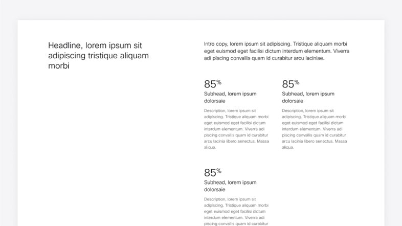
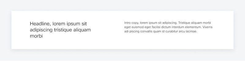
Qualitative and Benefits (default)
Emphasizes features, benefits, or capabilities in a more conversational form. 2-4 benefit statements.
- Headline: Required in AEM. Characters: ~60
- Lead-in Paragraph: Required in AEM. Summarize the featured content. Characters: ~180
- Benefit Subhead: Speaks to the value and outcomes that customers can expect. Characters: ~40
- Description: Characters: ~210
Qualitative and Quantitative Callout
Adds a single callout when there is an impressive data point that quantifies the values.
Note: Becaue the right side of this variation contains a Card component, an image can be added above the Callout Number (see example lower on the page). And some or all elements below the image can be deleted.
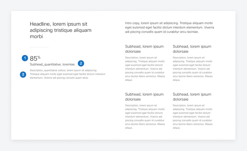
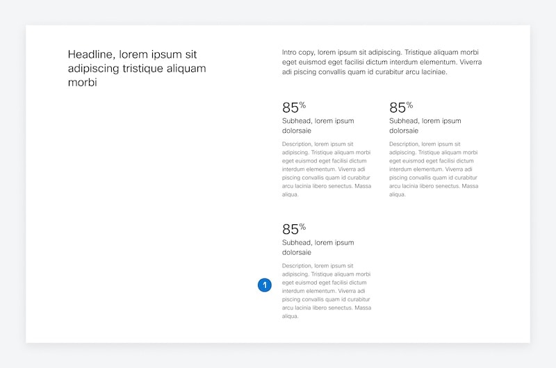
- Callout Number
- Callout Subhead: Summarize the data point. Characters: ~40
- Callout Description: Characters: ~180
Qualitative with Quote
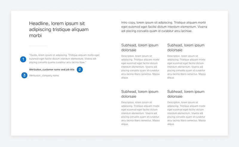
- Quote: Include a customer quote that illustrates the value proposition. Characters: ~180
- Customer Name: Customer name and if possible, their job title, separated by a comma. Characters: No limit. Do not truncate.
- Company Name: Company name and industry. If you cannot include the name of the company for privacy reasons, anonymize it by stating the industry, and, if applicable, a Fortune ranking. Characters: No limit. Do not truncate.
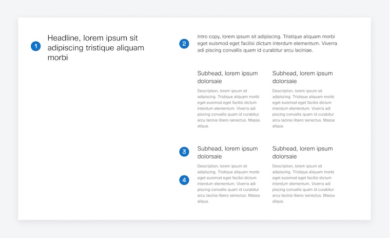
Quantitative
Adds multiple callouts when there are impressive data points that quantify the value of the product or solution. The pattern holds 2-3 data points.
- Description: Characters: ~210
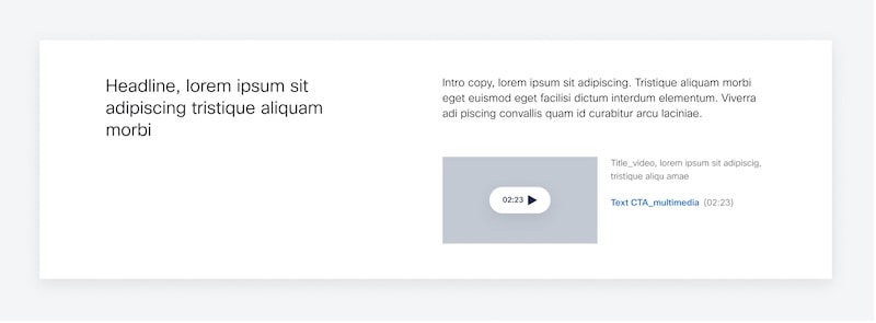
Qualitative and Video
Note: while the Video in this variation can be replaced by an image, the Qualitative and Quantitative Callout variation will handle images better, and won't require a Title below the image.
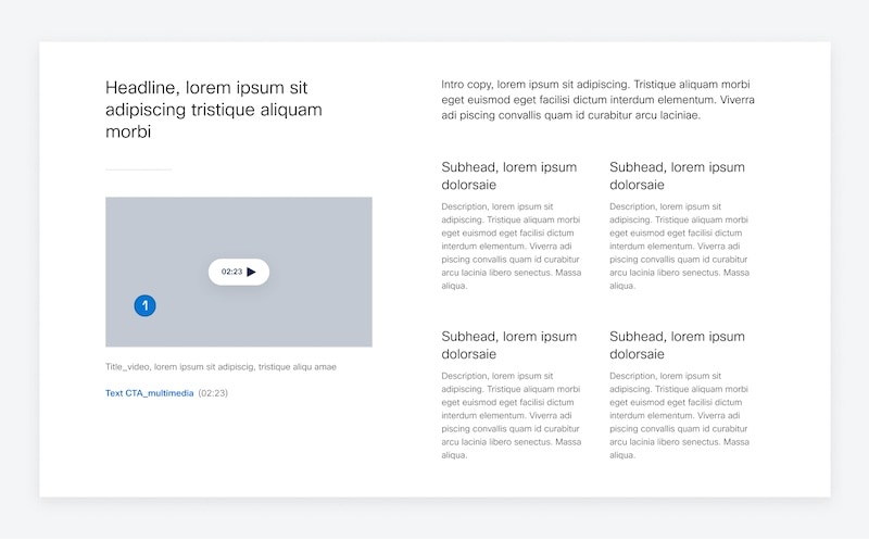
- Video Thumbnail: The video thumbnail is a 16-by -9 image of a still that best represents the video. Title is required in AEM. Characters:~60
Simple Links
Provides a collection of links around a particular topic.
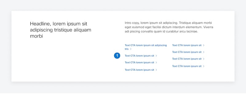
- Links: Up to 8 links. Characters: ~40
Simplified
Often used on wayfinding pages like Product Category to provide a very brief introduction before shifting into the hub patterns below.
Simple Video
Used when there is only a single benefit to promote with a supporting video.
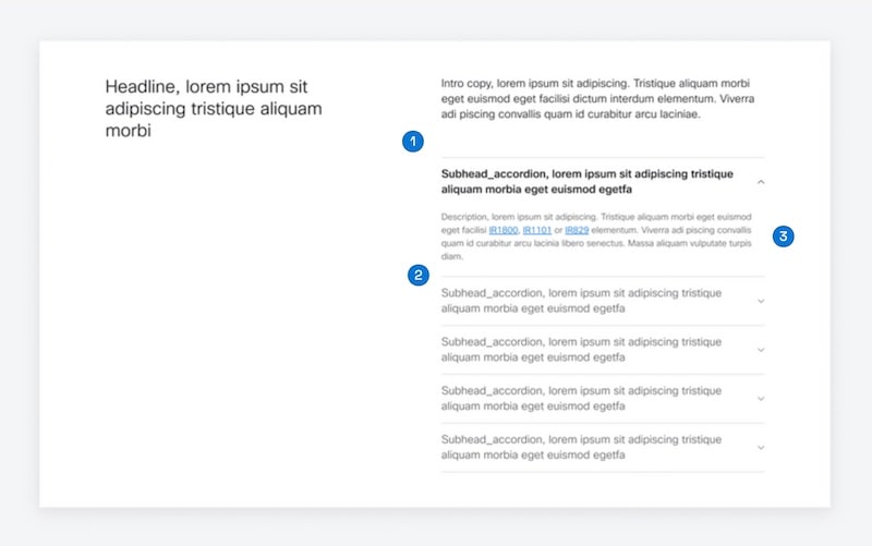
Simple Accordion
Example: With Bullets and CTA
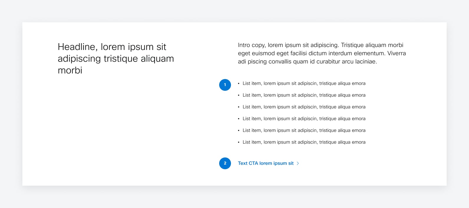
- Bullets: Characters:~60 (very fluid)
- Text CTA: Characters:~40
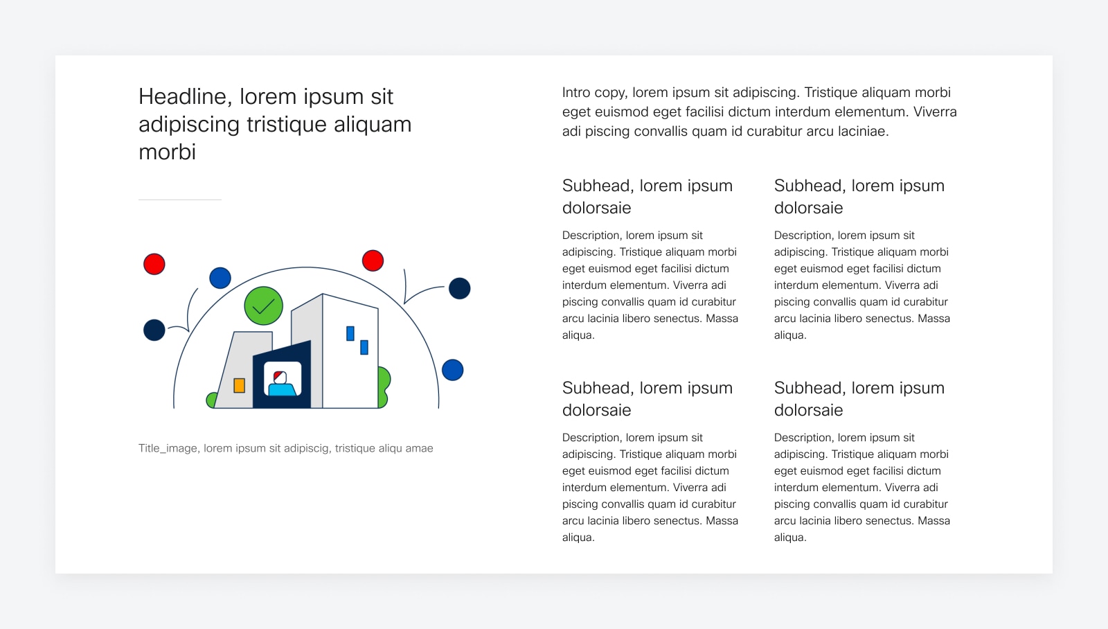
Example: With Image on Left
AEM notes: This is built off of the Qualitative with Quantitative Callout variation, as that variation provides a Card Component on right. The Card Component provides imagery settings relevant to image types such as logos.
Specifications
| Variation | Image type | Dimensions | Focal Point |
|---|---|---|---|
| Overview Simple Video | Video Screenshot | 316px x 178px [16:9] | Center and Middle |
| Overview w/Video | Video Screenshot | 546px x 307px [16:9] | Center and Middle |
| Overview with Image | Illustration, Lifestyle, UI Screen, Screen on Device | 419px x 236px [16:9] | Center and Middle |
Version
This information relates to Design v3.1 of this pattern.