Health Insights Overview
Health Insights is a network health application that performs real-time key performance indicator (KPI) monitoring, analytics, alerting, and troubleshooting.
It builds dynamic detection and analytics modules that allow operators to monitor and alert network events with user-defined logic.
It also provides prebuilt KPIs that are based on Model-Driven Telemetry (MDT), SNMP-based telemetry, or GNMI/Openconfig based telemetry collection. The Health Insights Recommendation Engine uses data mining to analyze your network and then recommends which telemetry paths you should enable and monitor.
 Important |
Due to the additional data collection tasks required, Health Insights requires the use of Extended Cisco Crosswork Data Gateways. |
 Note |
For the recommendation engine to work in Health Insights, you must ensure that connectivity is established between Cisco Crosswork Health Insights and the device. Enable the NETCONF protocol on the device itself, in the device configuration in Crosswork and in the credential profile for the device in Crosswork. |
The following high-level example gives a basic view of how Health Insights interacts with the other Cisco Crosswork Network Controller components:
-
Health Insights detects an anomaly: The optical bit error rate that you are monitoring on each of the links in your network suddenly increases.
-
Change Automation Playbooks automate remediation: Switch to the backup link immediately. Restore service. Open a ticket (manually initiated by the user). Alert the network engineer.
Health Insights is configured to gather the link bandwidth usage data for device links. After a time period, it establishes a performance baseline for each link. If a link deviates from its baseline causing an alert to be generated, Health Insights detects it and you can then go and run the Playbook to reconfigure the network to resolve the issue.
The complexity of the interaction will depend on the type of anomaly, how it is detected, and the Playbooks you choose to use to remediate it. You can orchestrate any form of network remediation using Change Automation Playbooks, helping you to close the loop on problem resolution and minimize network downtime.
Health Insights Alert Dashboard
The Health Insights alert dashboard provides device health summary information that is based on real-time network state events. The dashboard displays a network view of KPI sensors that are paired to specific device groups. Health Insights raises customizable events and alerts that are based on user-defined logic.
 Note |
Alert dashboard displays individual KPI alerts, although the mechanism of enabling KPI on a device is done through a KPI profile. |
To display the Health Insights dashboard, choose from the main menu.
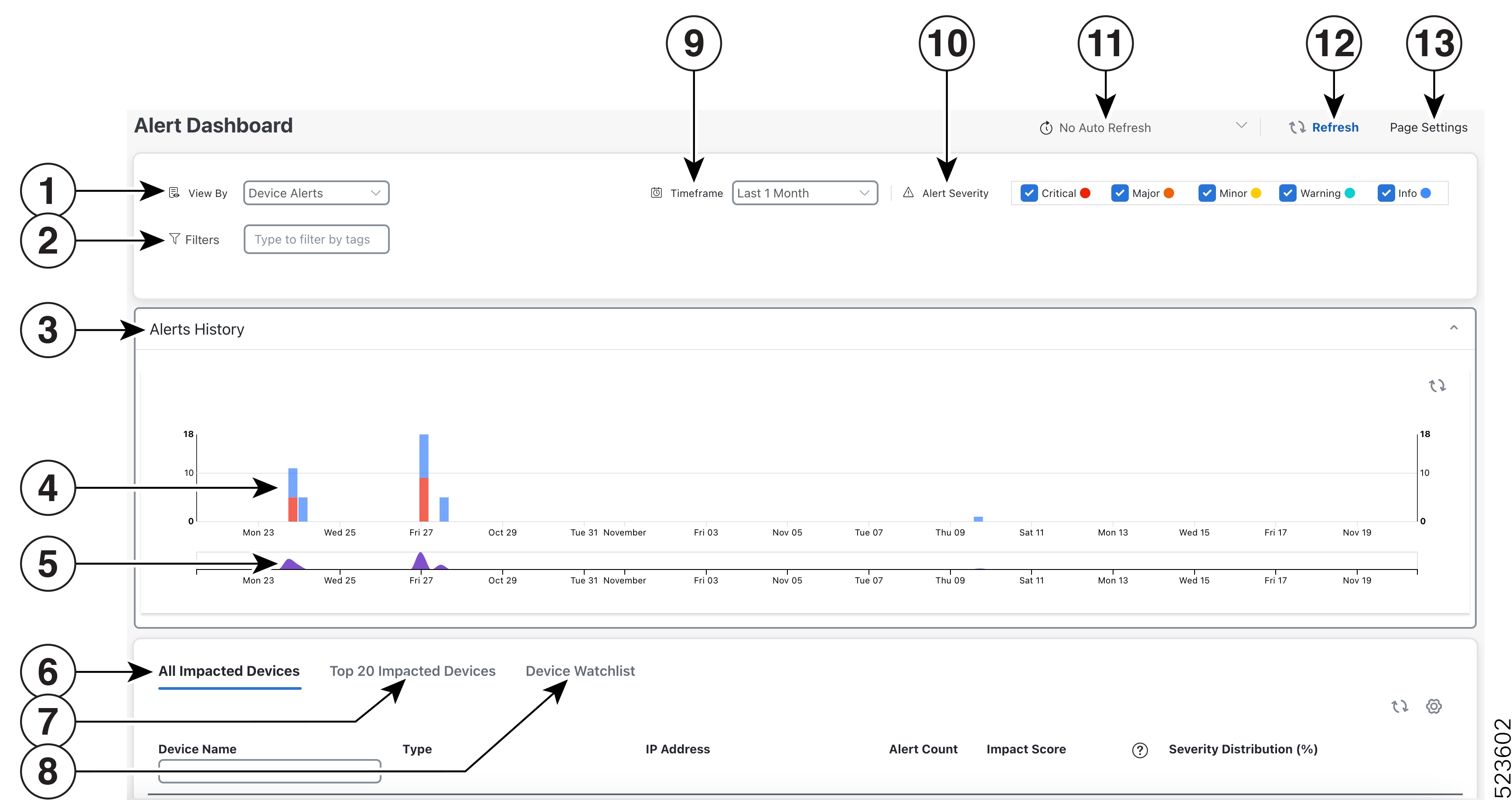
| Item | Description |
|---|---|
|
1 |
Device/KPI Alert Selector: Click here to toggle between device alert and KPI alert information. |
|
2 |
Filters: This field lets you filter the alert dashboard information by associated tag names. To select a tag, do one of the following:
Tag filters you create are not saved. If you open another window and then return to the alert dashboard, you need to re-create tag filters. |
|
3 |
Alerts History: This dashlet shows the total number of device alerts or KPI alerts that have been raised during the chosen time period, with detailed time lines showing both individual sets of alerts and the overall alert trend. |
|
4 |
Alerts History: The Alerts History line shows alerts as discrete bar indicators whose height represents the total number of alerts gathered at each point in time. To see the total for each type of alert, hover your mouse cursor over the bar indicator. You can also use the Alerts Trend line to zoom in on particular portions of the alert history. |
|
5 |
Alerts Trend Line: This line shows the overall trend in alerts for the chosen time period. You can use the Alerts Trend Line to select and zoom in on a specific time period within the Alerts History Line, as follows:
To restore the full view of the Alerts History Line, click on any point outside of the light gray shading on the Alerts Trend Line. |
|
6 |
All Impacted Devices/All Impacted KPIs: When selected, this dashlet provides a complete list of all devices or KPIs affected by alerts. The information for each affected device or KPI includes:
|
|
7 |
Top 20 Impacted Devices/ Top 20 Impacted KPIs: When selected, this dashlet displays a map of tiles, each tile representing one of the 20 devices or KPIs with the most alerts during the selected time period. The amount of space that each tile occupies in the map corresponds to the number of alerts raised: the more alerts, the bigger the tile. Also, the tiles are color coded. The colors correspond to the Alert Severity. To view more detailed information for a particular device or KPI, click the device or KPI name link in the center of the tile. |
|
8 |
Device/KPI Watchlist: When selected, this dashlet provides a list of all devices or KPIs, that you had selected from + Manage Deveice/KPI Watchlist, which are affected by alerts. The information for each affected device or KPI includes:
|
|
9 |
Timeframe: Specifies the time period for which the dashboard provides alert information: The last one hour, last day, last three days, last week, and last month. Please note that the dashboard provides alert information only, not telemetry information. |
|
10 |
Alert Severity: Maps the bar indicator colors that are used in the Alert History dashlet to the corresponding alert severity. To display or hide the alerts for a particular severity, click the check box for that severity. An enabled check box indicates that alerts of that severity have been raised and are being displayed. A clear check box indicates that the alerts of that severity are either not being displayed or have not been raised during the displayed time period. |
|
11 |
Auto Refresh: Specifies how often the dashboard is automatically refreshed. |
|
12 |
Refresh Icon: Refreshes the dashboard. |
|
13 |
Page Settings: Provides the default page settings for that particular session. You can customize the page display based on Alert Type, Timeframe, Auto Refresh, Detail Display, and Alert Severity. You can also change the weightage here for the impact score calculation. |
 Note |
The individual alerts for any specific KPI are shown in the dashboard. Alerts resulting from the alert group logic are not shown in the dashboard. Only the API shows the impacted results. |
View Alerts for Network Devices
After enabling KPIs on a device, you can view alerts for that device and get data for each performance indicator being monitored.
 Note |
The KPIs shown in the following steps are examples. There are many more KPIs available in Health Insights. For the complete list, see List of Health Insights KPIs. |
Procedure
|
Step 1 |
From the main menu, choose . The Health Insights Alert dashboard is displayed. 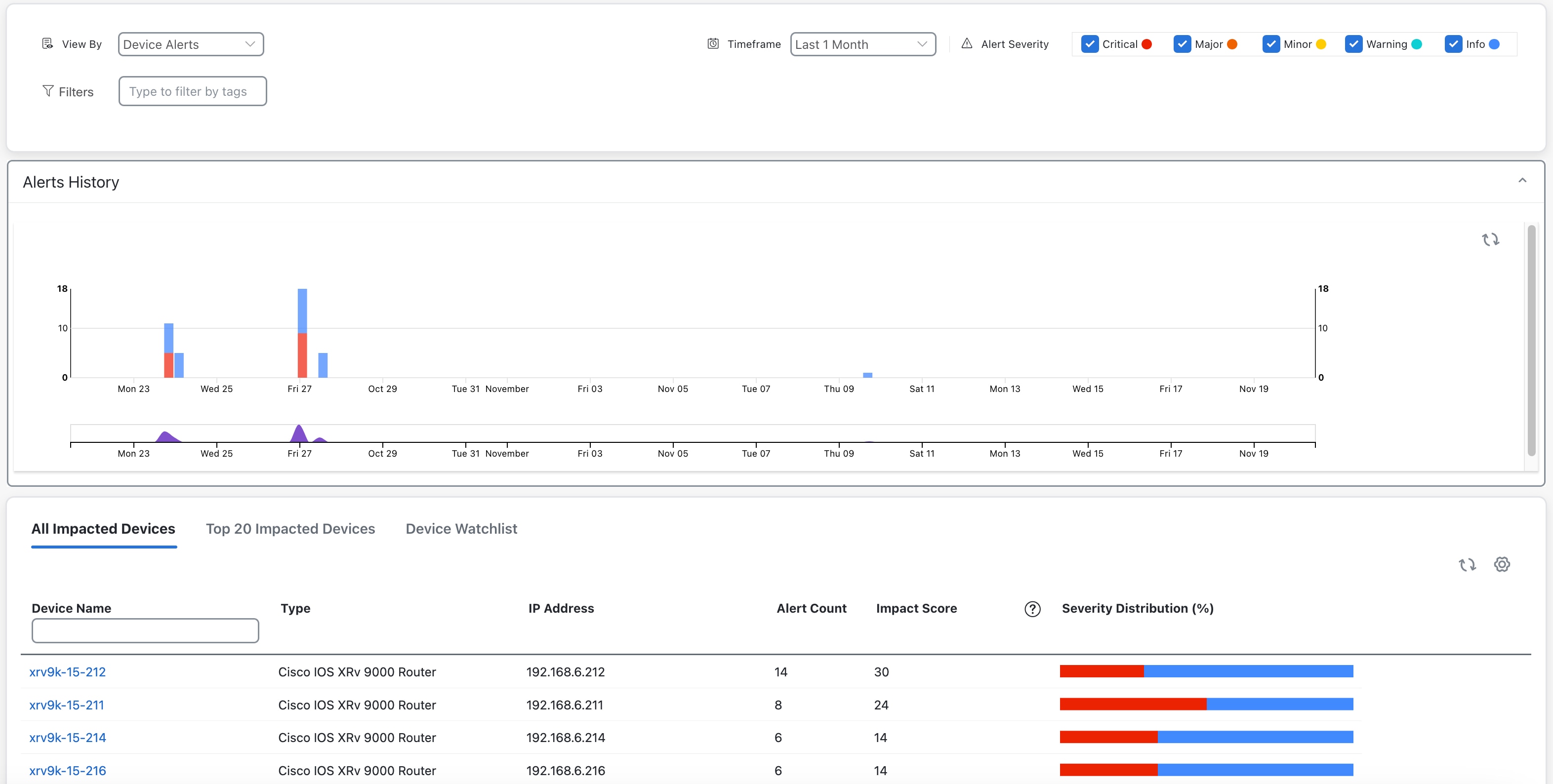 |
|
Step 2 |
Make sure that the Device Alerts view is displayed (select the View By: Device Alerts toggle, if needed). Then scroll down below the Alert History panel and click the All Impacted Devices tab. The dashboard displays a list of devices with alerts. |
|
Step 3 |
Click the Device Name for the device whose details that you want to view. Health Insights displays the device's basic Overview information, Alert History, a Topology map, and the list of the device's currently Enabled KPIs. 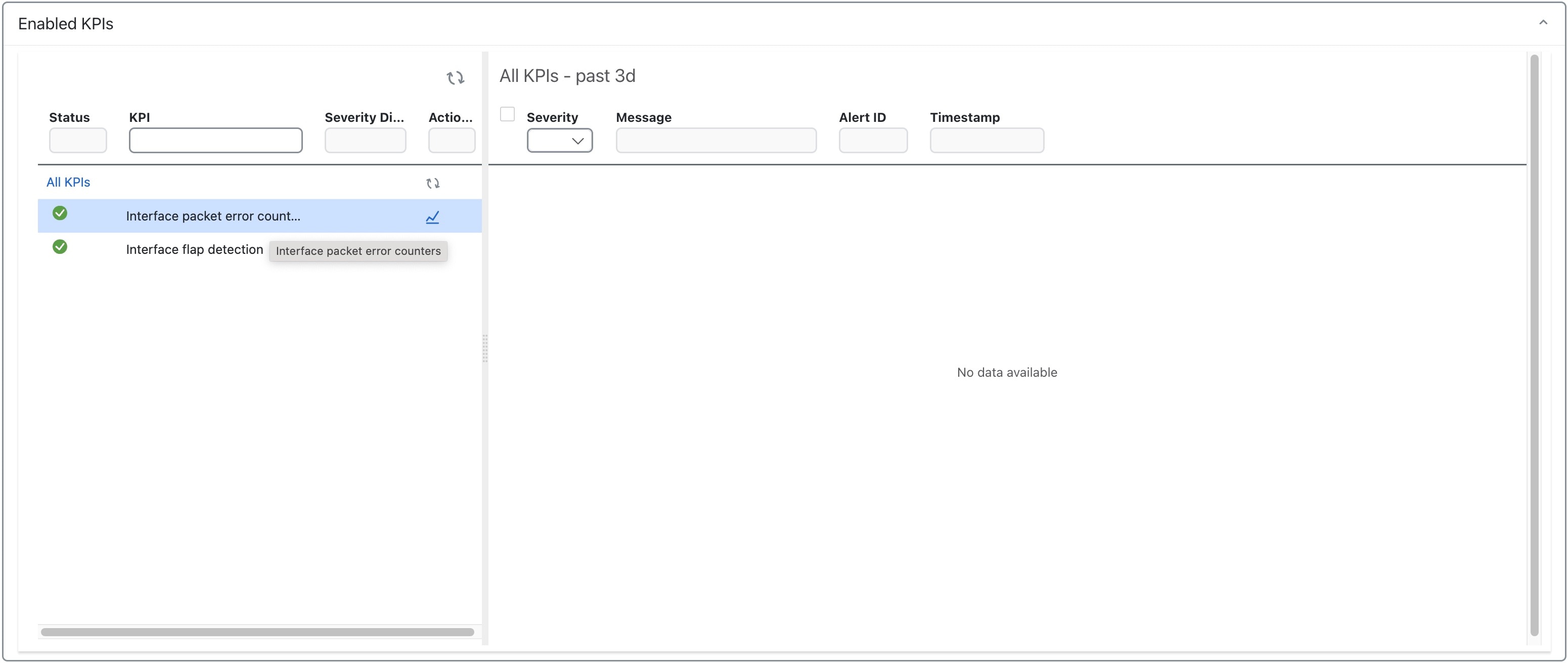 The Topology map is a version of the map that you see when you select Topology from the main menu, but centered on the device for which you are viewing KPI alerts. The Enabled KPIs panel lists all the KPIs currently enabled on the selected device, plus a list of all the alerts for that device raised by any of the enabled KPIs during the past hour. To see alerts for a different period, click the Timeframe dropdown (shown below) and select the time frame you want (up to Last 1 Month). 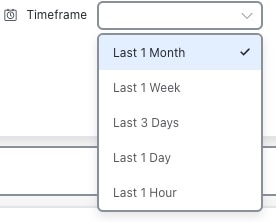 To focus the display only on alerts of the severity you want, check or uncheck the boxes in the Alert Severity field, (shown below).  |
|
Step 4 |
To view telemetry data received for any of the KPIs for this device: In the Enabled KPIs list on the left, click the |
|
Step 5 |
The timeline shows a blue box, with brushes on the sides, representing the limits of the time period shown in the graph at the bottom. Click on and move the blue box or the brushes on the timeline to select the desired time slot (up to 6 hours). Move the mouse cursor over any data point in the graph to view additional pop-up information for that data point. A red line or tag represents a point at which the KPI was triggered. This can occur on any subscribed statistic the KPI is monitoring. Health Insights collects and identifies the time points and frequency, which help determine when these events become an operational concern. |
|
Step 6 |
To focus the Grafana view on a different timeframe, click the time period field (with the clock icon) shown at the top of the Summary tab. You can select time periods up to several years. |
Telemetry Data Retention
Telemetry data is collected from devices and stored in the time-series database. This data is retained for the last 72 hours, and is used in the Health Insights Alert dashboard to identify alerts using a process that is known as stream based alerting. The resulting 'alerts'; if any, are stored in the same time-series database. The alerts are retained for 30 days, and the messages showing the duration of alerts are displayed in the top-right corner of the Device/KPI view in the Alert dashboard. For more information, see View Alerts for Network Devices. The alerts can also be queried using REST APIs. For more information, see the Cisco Crosswork Network Controller API Documentation on Cisco DevNet.



 Feedback