- Cisco StadiumVision Director External Content Integration Guide, Release 3.1
- Preface
- Overview of External Content Integration in Cisco StadiumVision Director
- Configuring External Content Integration in Cisco StadiumVision Director
- Configuring Optional and Advanced Tasks for External Content Integration
- Designing the Layout of External Content Using the Widgets Tool
- Troubleshooting External Content Integration in Cisco StadiumVision Director
Release 3.1: Cisco StadiumVision Director External Content Integration Guide
Bias-Free Language
The documentation set for this product strives to use bias-free language. For the purposes of this documentation set, bias-free is defined as language that does not imply discrimination based on age, disability, gender, racial identity, ethnic identity, sexual orientation, socioeconomic status, and intersectionality. Exceptions may be present in the documentation due to language that is hardcoded in the user interfaces of the product software, language used based on RFP documentation, or language that is used by a referenced third-party product. Learn more about how Cisco is using Inclusive Language.
- Updated:
- March 8, 2013
Chapter: Designing the Layout of External Content Using the Widgets Tool
- Prerequisites for Using the Widgets Tool
- Restrictions for Using the Widgets Tool
- Information About Using the Widgets Tool
- How to Design the Layout of External Content for Display
Designing the Layout of External Content Using the Widgets Tool
This module describes how to design the layout for display of the data that you have integrated and mapped for output in Cisco StadiumVision Director using the External Content Integration feature. This layout is required to create a content object referred to as a widget, that you can then publish with the standard features of Cisco StadiumVision Director using playlists and scripts for eventual display on TVs.
This module includes the following topics:
• Prerequisites for Using the Widgets Tool
•Restrictions for Using the Widgets Tool
•Information About Using the Widgets Tool
•How to Design the Layout of External Content for Display
Prerequisites for Using the Widgets Tool
Before you design the layout of external content, be sure that the following requirements are met:
•You have configured the external data sources and mapped the statistics to output fields in the External Content Integration feature.
•The data from the external source is being properly ingested by Cisco StadiumVision Director.
•You have added any standalone graphics that you want to add to the layout by importing them into Cisco StadiumVision Director from Control Panel > Content > Import.
Restrictions for Using the Widgets Tool
Before you design the layout of external content using the Widgets tool, consider the following restrictions:
•The Widgets layout tool can only be used for data sources that have been integrated into Cisco StadiumVision Director using the External Content Integration feature.
•Cisco StadiumVision Director only supports widgets that are created internally using the Widgets tool.
•Up to16 different sessions can be supported in the Widgets tool on a single computer.
•The maximum graphic size supported is 1920x1080, which is also the maximum size of the area supported in the Widgets layout tool.

Note If you attempt to use a larger graphic in the Widgets tool, it might not be displayed.
•The PicToScreen component has the following restrictions:
–A maximum of 5 images can be rotated using the PicToScreen component. Therefore, up to the first 5 images received from the data feed can be displayed. A new set of images can be retrieved at the next polling interval.
–Supports binding of image data fields only from a source feed. Therefore, the data source must be defined with an image field for output display. For more information on field mapping in the data source, see the "Selecting Input Statistics and Mapping to Output Fields for Display" section.
•The TextToScreen component supports binding of text data fields from a source feed. Therefore, the data source must be defined with a title, description, or other text data field for output display.
•The Widgets tool has the following font restrictions:
–Only the Arial font type with the ASCII character set is supported.
Note While you might be able to see a supported localized language and create text components with non-ASCII characters in the Widgets tool, these text components might not be rendered as expected on the DMP.
–The maximum font size is limited to 128 due to a restriction by the DMP.
–Importing of fonts is not supported.
•The following functions are not supported in the Widgets tool:
–Undo
–Deleting a group of multi-selected components
Information About Using the Widgets Tool
This section includes the following topics:
•User Interface Characteristics
Components
Overall, the Widgets tool includes four component types, which are either image-based or text-based. New components are added to the widget area simply by dragging the object type and dropping it onto the canvas or by double-clicking the component.
Standalone Text and Graphic Components
Two component types are intended for data with standalone text or graphics:
•Text Area
•Graphic
The Widgets tool uses the Graphic component to support the addition of standalone images. Each time a graphic component is added to a widget, it is added in numerical order as a Layer on the canvas.
Data Feed Components
Cisco StadiumVision Director Release 3.1 introduces two new component types to support generic data sources and feeds, whose content is either image-based or text-based.
P2S (PicToScreen)
The PicToScreen component supports only image data fields from the data source, and can display up to 5 images from a data feed. The images appear in a fixed overlapping cascade that rotates through the available images from the feed (Figure 1).
Note The cascading layout of the images cannot be changed. However, you can alter the position and orientation of the top graphic within the Widgets tool.
Figure 1 Example of PicToScreen Widget Display of 5 Maximum Images

Default Images and Display Behavior
Cisco StadiumVision Director has default images that are used as placeholders for any images that cannot be found or when the number of images received does not equal the number defined in the "Images to Display" property of the PicToScreen component (up to 5).
If Cisco StadiumVision Director must insert default images when enough images are not received from the data feed, then only the good images from the data feed are rotated through the cascading presentation. The default images will remain at the back of the stack in the presentation.
The default image is called DefaultImg.jpg and is found in the content library. You can change the default image by uploading your own image into the content library and change the "ContentName" property in the P2S component.
Image Orientation
You can change the position and rotation of the top graphic in the PicToScreen component. However, you cannot control the position or rotation of individual images within the stack.
T2S (TextToScreen)
The TextToScreen component can support any number of messages from the data feed.
Figure 3 shows an example of a fixed background graphic component, with a TextToScreen component overlay in Figure 3.
Figure 2 Example of TextToScreen Widget Background Graphic

Figure 3 Example of TextToScreen Widget Display

Layers
Similar to standard graphics editing applications, each time a Text Area or Graphic component is added to a widget, it is labeled in numerical order (by type) as a Layer on the canvas. Unless reordered, the first component added is at the bottom of the components added to the canvas, and the last component added is the topmost layer. In the user interface, the Layers box also lists the layers in stacking order with the topmost layer at the top of the list. In general, a background image should be at the bottom of the list.
You can reorder the layers by dragging and dropping them into a different order in the Layers box of the Widget tool.
The first graphic component added to the widget is identified as "graphic 1," and the first text area is labeled "text area 1." Components are numbered sequentially as they are added. Therefore, if you delete a component, that component number is not replaced.

Tip You can rename a component by double-clicking it.
Properties and Effects
The Properties panel allows you to set the characteristics of a component including explicitly setting its size, location, and rotation on the canvas.
Depending on the component type, some additional Properties and Effects are available:
•Standalone Text Area Component Properties and Effects
•Standalone Graphic Component Properties
•PicToScreen Component Properties and Effects
•TextToScreen Component Properties and Effects
Standalone Text Area Component Properties and Effects
In addition to setting the size, location, and rotation on the canvas for Text Area components, you also can specify the character string for the component, and select a font size and color.
Table 1 describes the property options and Table 2 describes the effects that can be applied to standalone Text Area components.
Tip Remember that the Widgets tool displays a white background for ease of use, but if you are not using any background images, a black font will not be visible on the TV screen because the TV background is actually black.
Standalone Graphic Component Properties
In addition to setting the size, location, and rotation on the canvas for Graphic components, you can import an image and also specify that it retain the dimensions of the original image.
Table 1 describes the property options that can be applied to standalone Graphic components. No effects are supported for Graphic components.
PicToScreen Component Properties and Effects
Table 3 describes the property options and Table 4 describes the effects that can be applied to PicToScreen components.
|
|
|
|
|---|---|---|
Image Duration |
Length of time (in seconds) to display the current set of images. |
Range is 5 to 25. Default is 5. |
TextToScreen Component Properties and Effects
Table 5 describes the property options and Table 7 describes the effects that can be applied to TextToScreen components.
Data Binding and Preview
After you have mapped the output fields for an external data source, you can bind that data to a component in a widget and see a preview of that live content feed.
Note Live data is polled for preview every 15 seconds in the Widgets tool. There can be a slight delay before you see an update of the content within a component. This polling interval is for preview only and is not the same polling interval used in the data source configuration.
Only certain data fields are supported for the PicToScreen and TextToScreen components. For more information, see the "Restrictions for Using the Widgets Tool" section.
User Interface Characteristics
Figure 4 shows the areas of the user interface for a new widget.
Figure 4 New Widget Interface

The Widgets tool interface supports some of the following functions and characteristics:
•Multi-selection of components using standard Control key sequences to move components as a group.
•Showing or hiding the bounding box of a component.
•"Zoom-to-fit" function by double-clicking the zoom knob.
•Change the widget dimensions by double-clicking the widget size in the upper right of the screen.
How to Design the Layout of External Content for Display
This section includes the following tasks:
•Showing the Component Bounding Box
•Resizing and Rotating Components
•Binding External Data to a Widget
Accessing the Widgets Tool
To access the Widgets tool, complete the following steps:
Step 1 Log into Cisco StadiumVision Director as an administrator.
Step 2 From the main menu, click Control Panel > Widgets.
A dialog box opens for you to select an existing widget or create a new one (Figure 5).
Figure 5 Dialog Box to Open Existing or Create New Widgets

Creating New Widgets
You can create a new widget when you first access the Widgets tool, or you can create a new widget from within the tool.
To create a new widget from within the tool, complete the following steps:
Step 1 From the menu bar in the Widgets tool, click File > New.
The Create New dialog box is displayed (Figure 6).
Figure 6 Create New Dialog Box

Step 2 In the Name box, type a name for your new widget.
Step 3 Do one of the following to specify the size of the widget:
•Click Pre-Set size and click the drop-down list to select a predefined dimension (WxH) for the canvas in pixels.
•Click Custom Size and specify a number (in pixels) for the width and height dimensions of the canvas.
Step 4 Click Create.
The tool displays a white box of the size that you created, with the dimensions that you specified displayed in the upper right corner (Figure 7).
Note The background canvas of the widget is actually transparent, but it is not shown with the graphics-standard checkerboard pattern to ease visibility of the components.
Figure 7 New Widget Screen

Step 5 Click File > Save.
Changes to the widget are saved.
Working with Images
This section includes the following topics:
Adding Standalone Images
Images can be added as a background to your layout in the Widgets tool, and they also can be bound to a data field using the External Content configuration, such as to add a team logo to a score field that will appear in the widget.
To support the addition of a graphic bound to a particular external source data field, see the "Modifying the Output Format of a Statistic" section.
The Widgets tool uses the Graphic component to support the addition of images as a background or in other places on your canvas.
Prerequisite
Before you can add an image to a widget, you must import the image file into Cisco StadiumVision Director by going to Control Panel > Content > Import to select and open a file. In the Import Content dialog box, specify any options and click Upload.
Procedure
To add an image to a widget, complete the following steps:
Step 1 Open or create the widget where you want to add an image.
Step 2 In the Components box, select the Graphic component and drag and drop it onto your widget canvas (Figure 8).
Figure 8 Drag and Drop Graphic Component on Widget Canvas
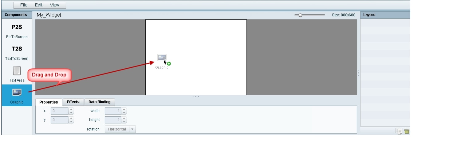
Tip Double-click a component to automatically add it to the canvas.
Step 3 To add an image, be sure that the graphic component where you want to add the image is selected, and click Change.
Step 4 In the Select Image dialog box, highlight the image that you want to add and click Select.
The image is added and scaled to the size of your graphic component box (Figure 9).
Figure 9 Image Added to Graphic Component

Step 5 Click File > Save.
Changes to the widget are saved.
Resizing and Rotating Images
Images will automatically scale to the size of the graphic component box in the widget.
Tip To find the size of your image file, use the List view for your images in Control Panel > Content. Select your image and look at the size in the Dimension field in the "Other content metadata" box.
You can scale the graphic to its original size after you add it, or if you modify the image size in the widget, you can revert back to its original size using the "Use original image size" option, which is recommended.
Figure 10 shows the options available on the Properties panel for a graphic component and displays the different bounding box handles that can be used to modify the size of a component box.
Figure 10 Graphic Component Properties Panel and Bounding Box Handles

You can modify the size and position of an image in the following ways:
•Explicitly setting values on the Properties panel.
•Selecting the bounding box and using the handles to modify it.
•With the graphic component selected, select the "Use original image size" checkbox to revert the image to its original size when imported.
For more information, see the "Resizing and Rotating Components" section.
Adding Text Areas
A text area component is added to a widget in the same way as a graphic component, but with some different properties. A text area supports a character string, and font size and color selection.
Currently the only available font is Arial.
To add a text area to a widget, complete the following steps:
Step 1 Open or create the widget where you want to add the text area.
Step 2 In the Components box, select the Text Area component and drag and drop it onto your widget canvas.
Step 3 In the Properties panel, type the character string for the box, and select the font size and color.
Figure 11 shows the options available on the Properties panel for a sample text area component.
Figure 11 Text Area Component Properties

Step 4 Resize or position the text area as needed. For more details, see the "Resizing and Rotating Components" section.
Step 5 Click File > Save.
Changes to the widget are saved.
Showing the Component Bounding Box
When you add a component onto the canvas, a temporary bounding box appears while the component is selected. If you move away from that component into another area of the canvas, you will not be able to see the boundaries of the component box.
Figure 12 shows an example of a text area and graphic component displaying the default setting without a visible boundary when the component is unselected. Notice that while the graphic component is selected the temporary bounding box is displayed in Figure 12, but when unselected it appears to disappear from the canvas (Figure 13).
Figure 12 Default Setting Without Bounding Box and Selected Component

Figure 13 Default Setting Without Bounding Box or Selected Components

To display a boundary around all components in the widget, complete the following steps:
Step 1 From the menu bar, go to View.
Step 2 Click Show bounding box.
A checkmark appears beside the option when the bounding box is enabled for display, and all components will display a boundary around them.
Figure 14 shows an example of a text area and graphic component after the Show bounding box option is enabled.
Figure 14 Show Bounding Box Option Enabled

Step 3 Click File > Save.
Changes to the widget are saved.
Resizing and Rotating Components
You can resize and rotate both Text Area and Graphic components in the following ways:
•Change the component location:
–Select the component and manually drag it to the location that you want on the canvas.
–Specify the x/y horizontal and vertical values directly in the Properties panel.
•Change the component size:
–Select and drag a handle on the component's bounding box to enlarge or reduce the component size. If using a handle on a side of the box, only that dimension is changed. If using a corner handle, both dimensions of the box are changed.
–Shift+Click on a corner handle to resize the box proportionally.
–Specify the width and height values directly in the Properties panel.
•Change the component angle:
–Select the rotation handle and drag the box up or down to rotate it.
–Shift+Click on the rotation handle and drag the box up or down to change the angle in 45 degree increments.
–Specify the rotation value in degrees directly in the Properties panel.
Figure 15 identifies the bounding box handles that you can use to resize and rotate components.
Figure 15 Bounding Box Handles

Binding External Data to a Widget
The widget supports the binding of external data to a text area component so that you can display dynamic output fields, such as game periods, scores, and so on from an external source.
Note If you add a text string to the component, it will be replaced by the real-time data from the output field that you specified in the Data Binding panel.
Prerequisite
Before you can bind external data to a widget, you must have configured your external data source and mapped the output fields by going to Control Panel > Setup > External Content. For more information, see the "Configuring External Content Integration in Cisco StadiumVision Director".
Procedure
To bind external data to a widget, complete the following steps:
Step 1 Open or create the widget where you want to add the text area.
Step 2 In the Components box, select the Text Area component and drag and drop it onto your widget canvas.
Step 3 In the Properties panel, select the font size and color. Optionally, specify a character string if you want to temporarily see some content in the component while the widget is open.
The font size and color will be applied to the bound data.
Step 4 In the Data Binding panel, double-click in the first cell under the Data Source heading and open the drop-down list (Figure 16).
Figure 16 Accessing the Data Source List

Step 5 Click the drop-down list and select the data source from which you want to bind data. Use the scroll bar to reveal all data sources as necessary (Figure 17).
Figure 17 Selecting the Data Source
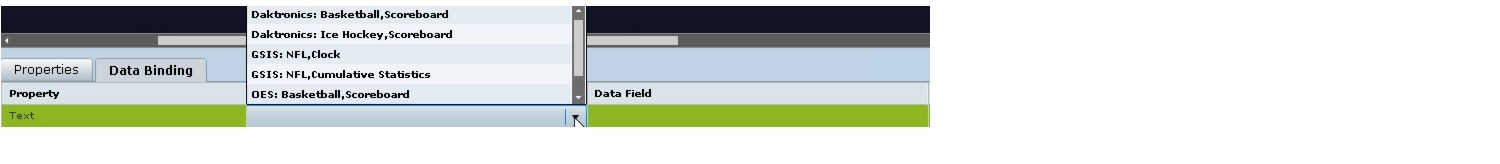
Step 6 Double-click inside the cell for the data field and select the drop-down list to select the data output field that you want to display in the text area component (Figure 18).
Figure 18 Selecting the Data Field

Step 7 Click File > Save.
Changes to the widget are saved.
Modifying Existing Widgets
This section includes the following tasks:
•Changing the Size of a Widget
Changing the Size of a Widget
To change the size of a widget, complete the following steps:
Step 1 Open the widget whose size you want to change.
Step 2 From the Edit menu, select Widget Dimension.

Timesaver You can also double-click the widget size in the upper right corner of the screen to open the Change Widget Dimension dialog box. See the "User Interface Characteristics" section.
Step 3 In the Change Widget Dimension dialog box, specify the new width and height values.
Step 4 Click Change.
Deleting Widgets
To delete a widget, complete the following steps:
Step 1 From the File menu, select Manage Widgets.
Step 2 In the Manage Widget dialog box, select the widget that you want to remove.
Step 3 Click Delete.
Renaming Widgets
To rename a widget, complete the following steps:
Step 1 From the File menu, select Manage Widgets.
Step 2 In the Manage Widget dialog box, select the widget that you want to rename.
Step 3 Click Rename.
The widget name is changed to an editable box.
Step 4 Type a new name for the widget.
Step 5 Click Close.
Configuration Examples
This section includes the following topics:
•Basic Widget Configuration Example
•TextToScreen Widget with Merged Generic Data Sources
Basic Widget Configuration Example
Note This example demonstrates use of the Text Area and Graphic components with data binding. The figures are based on the original interface for the External Content Integration feature; Therefore, some of the figures do not reflect all of the latest available components in the interface.
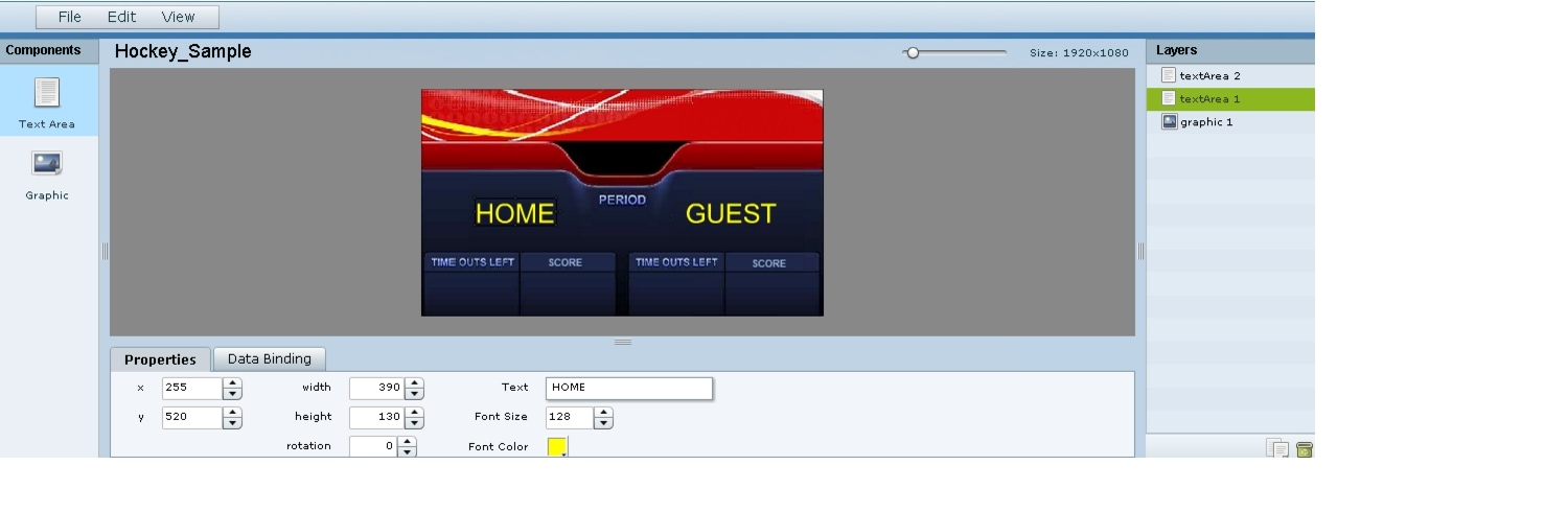
This section shows a basic widget configuration example to bind external data for an OES Ice Hockey Scoreboard data source. The example uses an image background (Figure 19) that creates static headings for Period, Time Outs, and Score, with companion text area components that will be created as layers on top of the background.
These text areas will be positioned beneath the background image headings and will have real-time data bound to them to appear in the widget.
Figure 19 Image Background for Scoreboard Widget

To create a widget and bind data to it, complete the following steps:
Step 1 Create a new widget with size 1920x1080.
Step 2 In the Components box, select the Graphic component and drag and drop it onto your widget canvas.
Step 3 With the graphic component selected, go to the Properties panel and click Change.
Step 4 In the Select Image dialog box, click on the background image that you want to add and click Select.
The image is added and scaled to the size of your graphic component box.
Step 5 In the Properties tab, specify the following values (Figure 20):
a. x and y—0
b. width —1920
c. height—1080
d. rotation—0
Figure 20 Background Image Added to Graphic Component

Step 6 Create two new text area components to add "HOME" and "GUEST" as the specified text string positioned as layers on top of the background graphic component (Figure 21).
Figure 21 Addition of Home and Guest Text Areas
a. Drag and drop the Text Area component onto the background graphic.
b. In the Properties panel, specify the following values:
–Text box—Type "HOME"
–Font size—128
–Font color—Choose yellow
c. Select the handles on the text area box and expand its boundaries enough to reveal the text.
d. Select the text area component and drag it to the left side of the background graphic over the Time Outs Left and Score fields.
e. Repeat steps a-d using "GUEST" text and drag the component to the right side of the background graphic.
Step 7 Add Text Area components to bind data for Period, Time Outs, and Score areas for both teams:
a. Drag and drop the Text Area component onto the background graphic.
b. (Optional) Zoom in as needed to see the component better.
c. Position and resize the component beneath the heading for which you are going to bind corresponding data (Figure 22).
d. (Optional) Add text to temporarily identify what data will be in the box, such as "period_data."
Figure 22 Text Area Component to Bind Period Data

e. In the Data Binding panel, select the OES: Ice Hockey, Scoreboard data source and the period data field (Figure 23).
Figure 23 Period Data Field Binding for OES Ice Hockey Scoreboard Source

f. Repeat steps a-e for all other data fields that you need to bind.
Step 8 Click File > Save.
Changes to the widget are saved.
TextToScreen Widget with Merged Generic Data Sources
This advanced example shows how to create generic data sources from RSS feeds, filter the data, and combine the feeds into a new data source for layout in the Widgets tool. The example highlights the following functionality in the External Content Integration feature:
•Generic data source configuration of an RSS data feed.
•Provision of XML sample data.
•Selection of specific item ranges in a data feed using the XPath expression editor.
•Merging of data sources into a data view.
•Data view configuration as a data source.
•Preview of received data in the data source.
•Use of a background graphic in the layout.
•Overlay of a TextToScreen component with data bound from merged data sources (a data view).
•Use of color properties in the TextToScreen component.
To create a TextToScreen widget with merged data sources, complete the following steps:
Step 1 From the Control Panel, click Data Integration.
For more information, see the "Accessing the External Content Integration Interface" section.
Step 2 Add a new Generic Data Source with the HTTP message type.
For more information, see the "Adding a New Data Source" section.
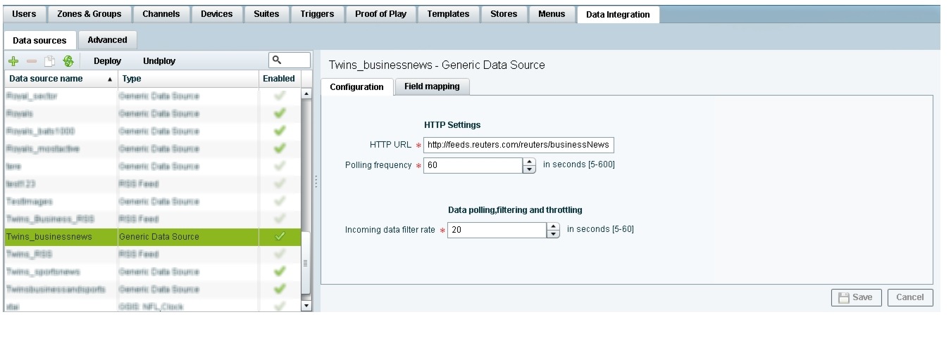
Step 3 In the Configuration panel for the new Generic Data Source, type the URL to your RSS feed.
Figure 24 creates a new Generic Data Source named "Twins_businessnews" with the following HTTP URL "http://feeds.reuters.com/reuters/businessNews". The rest of the configuration uses the default values.
Figure 24 HTTP Configuration for First Generic Data Source
Step 4 Click Field Mapping.
Step 5 Click the pencil icon to open the Sample data box, paste the sample XML data from the feed, and save it.
For more information, see the "Providing Sample XML Data for Generic Data Sources" section.
Figure 25 shows a portion of the XML data pasted into the Sample data box.
Figure 25 Sample Data for First Generic Data Source

Step 6 Expand the RSS input fields made available from the sample data and select a text-based input field to be used in the output display.
For more information, see the "Selecting Input Statistics and Mapping to Output Fields for Display" section.
Step 7 Select the Expression mapping option and click Ok.
The default XPath expression for the data field is added to the Mapping expression field. For an RSS title element, the default expression is "/rss/channel/title/text()."
Step 8 Click the pencil icon in the Output field icon bar to modify the XPath expression to filter the data provided by the feed.
Fore more information, see the "Modifying the Default XPath Expression" section.
Figure 26 shows a modification to the title data field to add the "item[position()>=2andposition()<5]" predicate to the default /rss/channel/title/text() expression:
/rss/channel/item[position()>=2andposition()<5]/title/text
In this example, the data will be filtered to pull the 2nd, 3rd, and 4th items in the title element of the feed.
Figure 26 Output Data Filter Using XPath Expression for First Generic Data Source

Figure 27 shows selection of the "title" field for output display with the modified mapping expression and the 3 items available for data preview from the RSS feed.
Figure 27 Field Mapping for First Generic Data Source

Step 9 Click the link under Data preview to open the "Preview for" window, and verify the data from the RSS feed.
Based on the filter used in our example to pull 3 items from the title element, a link named "3 items" appears under Data preview. Figure 28 shows the preview of the three title items from the first generic data source RSS feed.
Figure 28 Data Preview for First Generic Data Source with Business Data

Step 10 Repeat Step 2-9 for the second generic data source whose RSS feed content you want to combine with the first generic data source.
Figure 29 creates a second Generic Data Source named "Twins_sportsnews" with the following HTTP URL "http://feeds.reuters.com/reuters/sportsNews". The rest of the configuration uses the default values.
Figure 29 HTTP Configuration for Second Generic Data Source

Figure 30 shows the corresponding XPath expression to filter the data to pull the 4th, 5th, and 6th items from the title element for the second generic data source.
Figure 30 Output Data Filter Using XPath Expression for Second Generic Data Source
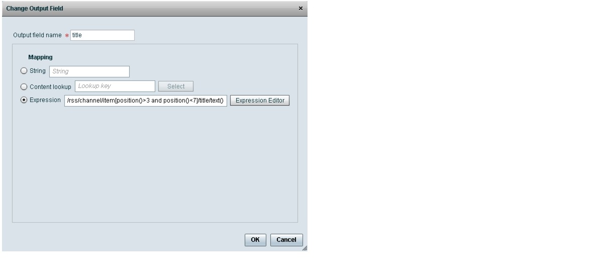
Figure 31 shows the preview of the 3 sports titles filtered from the second generic data source.
Figure 31 Data Preview for Second Generic Data Source with Sports Data

Step 11 To combine content from multiple data sources, click Advanced to create a data view and add the data sources that you created.
For more information, see the "Working with Data Views" section.
Figure 32 shows creation of a data view named "Twins_BusinessandSportsnews" with the "Twins_businessnews" and "Twins_sportsnews" data sources included.
Figure 32 Data View Creation with Two Generic Data Sources Added

Step 12 Configure a third generic data source that connects internally to the created data view.
For more information, see the "Configuring the Data View as a New Data Source" section.
Figure 33 shows configuration of the internal HTTP URL using the Cisco StadiumVision Director server IP address and the name of the "Twins_BusinessandSportsnews" data view.
Figure 33 Data View HTTP Configuration

Step 13 Go to Field Mapping and provide the sample XML data for the combined data sources.
The following is an example of the sample XML used:
Note The "entry" node is required in the sample data.
<command>
<type>xmlDataFeed</type>
<version>1</version>
<channel>com.cisco.sv.databind</channel>
<xmlDataFeed>
<hashcode>45adde4260b54cb41765345a21efd3dc</hashcode>
<xmlDataFeedEntry>
<name>.Twins_businessnews.title</name>
<value>
        <entry index="0">Exclusive:Thermo Fisher weighs Life Tech takeover -
sources</entry>
<entry index="1">Chesapeake CEO McClendon steps down after year of tumult</entry>
</value>
</xmlDataFeedEntry>
<xmlDataFeedEntry>
<name>.Twins_sportsnews.title</name>
<value>
<entry index="0">Never-say-die Kings rally to haunt Canucks again</entry>
<entry index="1">49ers' Moss: "I'm the greatest receiver ever"</entry>
<entry index="2">MLB investigating doping report involving top players</entry>
</value>
</xmlDataFeedEntry>
</xmlDataFeed>
</command>
After the XML sample data is saved, the data sources are combined.
Figure 34 highlights the new link to 6 items available for preview, which includes the 3 items from the business data source and 3 items from the sports data source.
Figure 34 Data View Field Mapping

Step 14 Click the link in the Data preview column to verify the content for display.
Figure 35 shows the combined title items from both the business and sports feeds.
Figure 35 Data View Field Mapping

Step 15 Go to the Widgets tool.
For more information, see the "Accessing the Widgets Tool" section.
Step 16 Create a new widget.
For more information, see the "Creating New Widgets" section.
Step 17 Add a Graphic component to the canvas and adjust the size to accommodate the title fields from the RSS feeds.
For more information, see the "Working with Images" section.
Step 18 Add a TextToScreen component to the canvas to overlay the Graphic component.
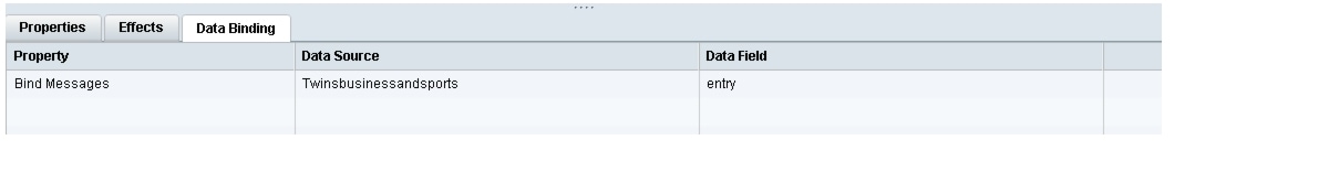
Step 19 Bind the data view data source to the TextToScreen component.
Figure 36 shows binding of the "Twinsbusinessandsports" data source.
Figure 36 Data Binding of the Data Source Created From the Data View
Step 20 In the Properties panel, set the options and choose the font colors.
Figure 37 shows the properties used with black set for the first color, and red set for the second color. The bound data automatically appears in the widget. Since two different colors were set in the component properties, the colors will alternate for each message.
Notice that the first message of the combined data that was displayed in the Data Integration preview in Figure 35 appears in the Widget in black font, followed by the second message in red.
Figure 37 TextToScreen Data Preview of First Message Color

What to Do Next
After you have completed creating a widget, complete the following steps to publish it for display:
1. Create a playlist from the Control Panel for the widget that you created. Widgets are categorized in the "By Type" folder under the "widget" type.

2. Create an event script to run the playlist.
3. Schedule the script to display the content on a TV.
 Feedback